I don’t like DataGrids
I recently did a review of WPF data grid controls for the company I work for. The developers are struggling with some limitations and bugs in the grid control that we currently use and they wanted something better. So I went ahead and created two requirement lists, one with the UX requirements and one with the development requirements, and then started looking at the usual suspects: Telerik, DevExpress, Infragistics etc. In the middle of reading feature lists and testing demo examples I realized something important: I actually don’t like DataGrids.
By that I mean that I don’t like DataGrids as design elements in user interfaces. As a user I hate them because there are many bad implementations that are cumbersome to use, especially if you are required to enter or edit data. As a developer I don’t like them because often the paradigm selected by the vendor of the grid control doesn’t fit the need of the implementation and you need to add a lot of custom code to work around it. As a designer I despise them because Grids are too often used out of old habits as the default control for displaying or editing a collection of data, when in many cases they are completely wrong for the job.
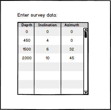
Let me give an example: When creating software for the oil industry, one data set that you often meet is the well trajectory or survey data. For software related to production or drilling of an oil well this is often a necessary input as it describes the geometry of the well, or how the well path is positioned in 3D space. It is usually described with a list of depth, inclination and azimuth, and the normal action is to create a window with a grid control with three columns. Something like the sketch below.

The implementation is easy enough, you create a class SurveyPoint with depth, inclination and azimuth as fields and then you use data binding to bind the grid to a list of SurveyPoints. Cool, you now have a way for the user to enter the survey data. Except that it’s not that easy. For with data binding an empty list means an empty data grid. You might convince the grid to let you add rows, but most data grids uses the database analogy and adding a row is like adding a record: You may only add them one by one, and for some reason you can only add new rows from the top row. And that doesn’t fit well here as the normal operation to add survey points is to start at depth zero and add them in increasing order. Your option is then to either try to find a grid that supports adding from the bottom, or write code yourself to extend the grid to allow this.
Another requirement that quickly appears when using a grid as a data editor is that it should “work like Excel”. I have seen this requests coming up many times, and typically from users which are quite used to Microsoft Excel. It is an understandable request because a data grid looks very much like a spreadsheet so as a user, why shouldn’t you want it to work like you are used to. “Work like Excel” usually means that navigation, editing, selection and copy/paste should be similar to Excel. If you are lucky your grid supports it, if not you must add even more code to extend the functionality of the grid.
There is a fundamental flaw in the above scenario. There is no consideration of where the user get the survey data from. It assumes that the user will enter the full well trajectory by hand. For survey data this is very seldom the case. In most cases the survey data is provided from another source, often in the form of an Excel file or in some other format, like column based text, CSV, etc. Forcing the user to re-enter data that he already has in an electronic format is a waste of the user’s time. Even if you extend the grid to support copy/paste from Excel, it is still an unnecessary step.
The above example is not unique. Too often a grid control is selected as the easy choice because the data is a list of some kind. Just as often, it ends up only almost fitting the purpose, forcing the developer to spend a lot of time to extend the functionality of the grid, or worse, forcing the user more effort to enter data uncessecarily.
