
The tl;dr effect
Have you ever been presented with a UI that is just overwhelming with information and gives you the feeling that it is just not worth it to digest it all? Maybe you just initiated one specific action, but the UI that is displayed has just too much information to process, and why should you be forced to read it all just to complete what you are trying to do? I call this the tl;dr effect.
It is named after the abbreviation for “too long; didn’t read”, often used as reply to overly long forum posts to indicate that it is too wordy or drawn out that people don’t want to read it. The tl;dr effect is an anti-principle of user experience design. When an UI is filled with a lot of text or items and expects the user to care about everything, it may have the opposite result where the user is overwhelmed and just skips it all. The effect is that intentionally or unintentionally, possibly important information is drowned out by at lot of unimportant one.
End-user licenses
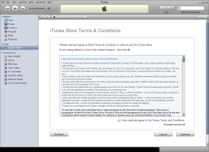 A typical example of the effect is in the EULA or Terms of conditions as depicted in the iTunes screenshot on the left. It is a known fact that very few take the time to actually read through an EULA, but still you are often met with the requirement to agree to one to be able to use an application or a service. Most people, myself included, when met with this often enough are “immunized” against reading the text and just automatically accepts the agreement. Luckily for us there are some that read through them thoroughly and catches any problematic conditions like in the recent Instagram turmoil.
Installers
EULAs are often a part of an application installer, which is a particular sensitive place for the tl;dr effect. People’s threshold for long reads are particularly low when running installers. It may be caused by impatience, where you do not want to spend a lot of time taking decisions in installers, but want to use the application as quickly as possible. Inexperienced users may be wary about the whole installer experience and tend to trust the recommendations from the vendor. Which is why so many end up with an unwanted new toolbar from Ask just because they install an update to Java.
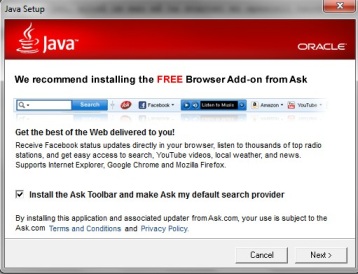 Consider the installer page on the right that is part of all recent Java updates. This is an example of an intentionally caused tl;dr effect. The page is filled with a combination of text and images, where the text consists of three different font sizes. The word FREE is conveniently emphasized in the title, while the rest of the text is kept rather dense. There is even a Terms and Conditions hidden in the bottom text. The option to install the Ask toolbar is pre-selected so you have to actively deselect it to avoid it, and you have to read the text on the page to understand this. There are many that will impatiently keep hitting the Next button until the installation is done and will miss the consequence of this page.
Dialog boxes
The place where people have the least tolerance for long texts are dialog boxes. From observing many people’s behaviour towards dialog boxes over the years, I have seen that the most usual response to a dialog box is to just click OK immediately without even a cursory look at the text in the box. For a developer, this behaviour may seem weird because when the developer feels the need to interrupt the user’s workflow, it is because the user must make an important decision. While the user dislikes being interrupted in the workflow by something that in most cases is unimportant and just presses OK to get it quickly out of the way so he can continue.
So how do you solve this dilemma? Many argue that you should avoid using dialog boxes altogether. Alan Cooper has a great chapter in his book About Face about unnecessary error messages and confirmations. I will not go into that discussion here, but just say that dialog boxes are a disturbing element in a user’s work flow and should be used sparingly. If you still have the need to use a dialog box, make sure to present a concise message and use choices that states clearly what the consequence are of selecting it instead of the standard OK/Cancel. On Windows, the Task Dialog that Microsoft introduced with Windows Vista is a good choice. This is demonstrated with an example using a dialog that was found on a web page containing a form.
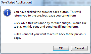
There are several problems with this dialog: The title of the dialog have nothing to do with the confirmation the user is asked about. The OK/Cancel choices does not match the choices that the user must make and the message text must therefore include an explanation of what the choices mean. And worst of all, the choices provided does not match the action that the user has taken. The action that triggered this message box was that the user pressed the browser back button. If you don’t read the text in the message box it is naturally to think that selecting OK will complete the user action and go to the previous page, but in this case it is actually the other way around. Pressing Cancel to complete the action is counter-intuitive. Using the features of a task dialog, you can present a much clearer choice.
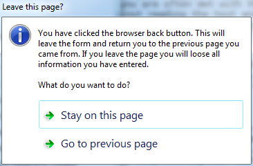
Instead of OK/Cancel buttons, this example uses Command links that clearly states what happens when they are selected. This gives the user clear choices. Even if he skips reading the text in the dialog, there is no misunderstanding what the consequences of the two choices are and he can make the right choice quickly.
These are just a few examples of UI types where the tl;dr effect may cause your users to miss important information or make the wrong choices. To reduce this problem, apply Hicks law to your UI, make messages brief and concise, and make the consequences of the user’s choices clear.